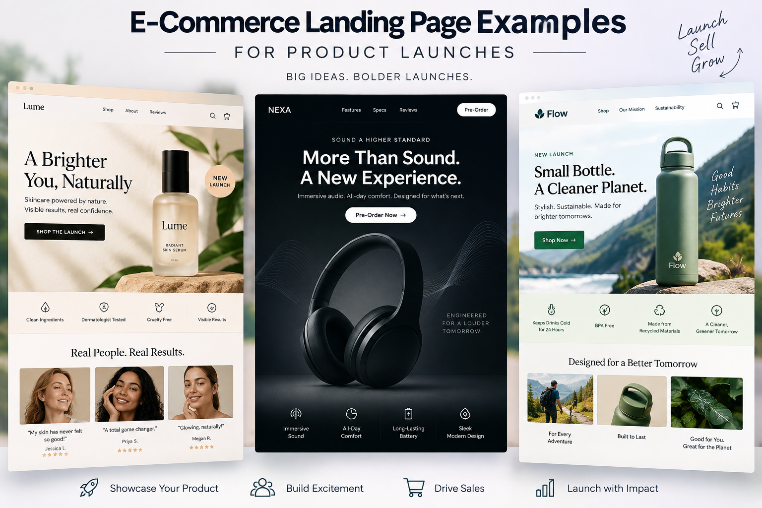
A strong e-commerce landing page gives a product launch one clear place to turn interest into action. It can introduce the product, explain the benefits, answer common questions, and guide shoppers toward buying, pre-ordering, or joining a waitlist. The right setup can also make paid campaigns easier to track and optimize.
Here’s what effective product launch landing pages usually include and how brands can build one that converts.
What Is an E-Commerce Landing Page?
An e-commerce landing page is a focused page built around a specific product, offer, campaign, or customer action.
For a product launch, the page usually gives shoppers everything they need to understand the product and decide what to do next.
How an E-Commerce Landing Page Differs From a Product Page
A standard product page usually sits inside a larger online store and includes regular navigation, categories, recommendations, and other shopping options.
An e-commerce landing page is much more focused. It is usually built around one product or campaign with fewer distractions and one main conversion goal.
When Should E-Commerce Brands Use Landing Pages?
Landing pages work well when a brand wants to promote:
- A new product
- A pre-order
- A limited-edition release
- A seasonal launch
- An influencer collaboration
- A waitlist or early-access campaign
- A specific paid advertising offer
They are especially useful when the brand wants campaign traffic to see messaging created specifically for that launch.
Why an E-Commerce Landing Page Matters for Product Launches
When someone clicks on an ad or email for a new product, they usually want to learn about that specific product. Sending them to the homepage makes them search for it, while a dedicated product launch landing page puts everything they need in one place.
Creates a Focused Product Launch Experience
A launch page keeps the attention on the product being promoted. The headline, images, copy, reviews, and CTAs can all work together to explain the product and guide shoppers toward the next step.
Improves Conversion Opportunities
Shoppers are more likely to take action when they can quickly understand what the product is, why they might want it, and how to buy it. A high-converting landing page makes that path clear without surrounding them with unrelated products or links.
Makes Paid Campaign Traffic More Relevant
If someone clicks an ad for a new skincare serum, they expect to see that serum when the page loads. Sending them directly to a page that matches the ad keeps the experience consistent and lets them continue exploring the product right away.
Helps Communicate the Product’s Unique Selling Proposition
New products often need a little explanation, especially if shoppers are seeing them for the first time. A launch page gives the brand room to highlight the main benefits, features, ingredients, materials, use cases, or anything else that makes the product worth considering.
Makes Product Launch Performance Easier to Measure
A dedicated landing page also gives brands a clearer picture of how the launch is performing. They can track traffic, CTA clicks, sign-ups, conversion rates, and purchases tied to the campaign, making it easier to see what is working and what may need improvement.
Read more: Landing Pages vs. Websites: What Converts Better for Lead Gen?
Key Elements of a High-Converting E-Commerce Landing Page
Strong e-commerce landing page examples usually have a few things in common.
Clear Product-Focused Headline
The headline should quickly explain what the product is or why shoppers should care. Keep it simple enough that visitors understand the main value without reading the entire page.
Strong Product Images and Videos
Shoppers cannot physically inspect the product online. High-quality photos, close-ups, lifestyle images, demonstrations, and short videos can help show what they are buying and how it works.
Benefit-Driven Product Copy
Features explain what the product has. Benefits explain why those features are useful. Good e-commerce product page design makes both easy to understand, but the strongest launch pages usually lead with customer benefits.
Prominent Call-to-Action Buttons
The main action should be obvious.
Common CTAs include:
- Shop Now
- Pre-Order Now
- Join the Waitlist
- Get Early Access
- Add to Cart
- Reserve Yours
CTA language should match the stage of the launch.
Social Proof and Customer Reviews
Reviews, creator mentions, ratings, testimonials, or early feedback can make a new product feel less unfamiliar. This is especially useful when customers have not seen the product before.
Trust and Purchase-Reassurance Elements
Shoppers may have questions about shipping, returns, payments, warranties, or product guarantees. Keeping this information easy to find can remove some of the hesitation around buying.
Product Launch Urgency and Scarcity
Limited quantities, launch pricing, pre-order deadlines, and early-access windows can encourage faster action. Any urgency used should be real and clearly explained.
E-Commerce Landing Page Examples for Different Product Launches
No single format works for every launch. The page should match the product, offer, and action the brand wants customers to take.
New Product E-Commerce Landing Page
A new product page should quickly introduce the product and explain why it is useful. A simple flow might include a strong hero section, product benefits, images, social proof, pricing, FAQs, and a purchase CTA.
Pre-Order Product Launch Landing Page
Visitors should understand what they are reserving, how much it costs, when it is expected to ship, and what happens after they place the order.
Limited-Edition E-Commerce Landing Page
Limited releases benefit from a stronger sense of urgency. The page can highlight limited quantities, exclusive details, or the final order date while keeping the purchase path simple.
Waitlist and Early-Access Landing Page
A waitlist page usually asks for less commitment. The main goal may simply be collecting an email address in exchange for launch updates, early access, or a first chance to buy.
Influencer Product Launch Page
Influencer launches can use creator images, quotes, videos, and product demonstrations to connect the product with the collaboration. The page should still keep the product itself at the center.
Seasonal Product Launch Landing Page
Seasonal launches can connect the product to a specific moment, such as summer, holidays, back-to-school season, or gifting. The message should make it clear why the product fits that occasion.
Product Launch Landing Page Examples by E-Commerce Industry
A landing page for a new pair of shoes probably shouldn’t look or read the same as one selling a skincare serum or a new gadget. The product and what customers need to know before buying should shape the page.
Fashion and Apparel Product Launch Pages
Fashion is highly visual, so the product should do most of the talking. Strong photography can show the fit, details, and different ways to wear the item, while sizing information and clear purchase options help shoppers decide if it belongs in their closet.
Beauty and Skincare Landing Pages
Beauty shoppers usually want to know what a product does and how it fits into their routine. A launch page can cover the benefits, ingredients, directions, reviews, and before-and-after content when appropriate, while answering the questions customers are likely to have before trying something new.
Consumer Electronics Product Launch Pages
Electronics often need a bit more explaining because customers may want to compare features, specs, and compatibility before buying. Product demos, comparison charts, key features, warranty information, and real-world use cases can make all those technical details much easier to digest.
Food and Beverage E-Commerce Landing Pages
Food and beverage pages should make the product look and sound good enough to try. Great photography can grab attention, while ingredients, flavors, serving ideas, pack sizes, subscription options, and customer reviews give shoppers the practical details they need.
Home and Lifestyle Product Launch Pages
For home and lifestyle products, customers often want to picture the item in their own space. Lifestyle images can help with that, while dimensions, materials, care instructions, and practical benefits answer the questions that usually come before buying.
Subscription Product Landing Pages
Subscription pages should make the setup easy to understand before customers sign up. Explain what they receive, how often it arrives, what it costs, available options, subscriber perks, and how changes or cancellations work so there are no surprises later.
E-Commerce Landing Page Design Best Practices
Good design should make the page easier to understand and use. Here are some of the best practices you can apply to your own landing page:
Keep the Page Focused on One Primary Goal
Choose one main action for the page.
If the launch goal is pre-orders, most CTAs should point toward pre-ordering rather than sending visitors to unrelated categories.
Place the Main CTA Above the Fold
Visitors should not have to scroll through half the page to find out how to buy. Place the primary CTA near the main product message and visual.
Use a Clear Visual Hierarchy
Headlines, images, benefits, pricing, reviews, and buttons should be easy to scan. Visitors should quickly understand the most important information.
Make the Landing Page Mobile-Friendly
Buttons should be easy to tap, text should be readable, and product images should fit smaller screens without slowing down the page.
Reduce Unnecessary Navigation
Keep navigation simple, and remove anything that doesn’t help the shopper understand or buy the product.
Keep Page Load Times Fast
Heavy videos and oversized images can slow down even a great page. Compress visual assets and load only what the experience needs.
Repeat CTAs Strategically Throughout the Page
Longer pages may need several CTA buttons. Place them after key sections so shoppers can act once they have enough information.
Read more: Getting Started with Landing Page Optimization
How to Structure an E-Commerce Landing Page for a Product Launch
A simple structure can help the page move naturally from interest to purchase.
Section 1 – Hero Banner and Main Product Value Proposition
Start with the product name, main benefit, strong visual, and primary CTA. Visitors should know what is being launched within a few seconds.
Section 2 – Product Benefits and Features
Explain what makes the product useful. Focus on the benefits shoppers are most likely to care about.
Section 3 – Product Images or Demonstration
Show the product in detail or in use. This may include lifestyle photos, close-ups, videos, or product demonstrations.
Section 4 – Why Customers Should Choose the Product
Explain what makes the product different from other options. Keep the message specific rather than relying on vague claims.
Section 5 – Reviews, Testimonials, and Social Proof
Add customer reviews, expert mentions, creator feedback, or other proof that helps support the product.
Section 6 – Pricing, Offer, or Product Bundle
Make the cost easy to understand. If there is a launch discount, bundle, free shipping offer, or bonus, explain it clearly.
Section 7 – Frequently Asked Questions
Answer the questions that could stop someone from buying. Shipping, returns, sizing, compatibility, ingredients, product use, and delivery dates are common topics.
Section 8 – Final Product Launch CTA
Keep the closing simple. End with a clear reminder of the product’s main value and one final CTA.

How to Optimize an E-Commerce Landing Page for SEO
Landing pages built for campaigns can also attract organic traffic when they are properly optimized.
Include the Primary Keyword in Important Page Elements
Use the main e-commerce landing page keyword naturally in the title, H1, meta description, introduction, and relevant copy.
Avoid forcing it into every section.
Target Product Launch and Commercial Keywords
Related keywords can help the page reach people who are actively researching or shopping.
Terms around product type, launch intent, use cases, and purchase intent may all be useful depending on the offer.
Optimize Product Images Without Slowing Down the Page
Good image optimization supports accessibility, SEO, and page speed at the same time, so use descriptive file names and alt text while keeping image sizes manageable.
Add Relevant Internal Links
Link to useful supporting pages such as shipping information, returns, product categories, buying guides, or related products. Keep these links relevant to the customer journey.
Use Product and Review Schema Where Appropriate
Structured data can help search engines understand product details, reviews, prices, and availability. Implementation should match the actual content visible on the page.
Create Helpful, Original Product Content
Useful descriptions, FAQs, product comparisons, demonstrations, and original insights can make the page stronger for both search and conversions.
How to Optimize a Product Launch Landing Page for Conversions
A good landing page can still improve after launch. Testing can show what helps more shoppers click, buy, or sign up.
Match the Landing Page With Your Ad Messaging
Keep the headline, product, and offer consistent with the ad that brought shoppers there. This creates a smoother path from click to purchase.
Test Headlines and Product Positioning
Try different ways of introducing the product, such as focusing on its main benefit, the problem it solves, or what makes it different.
Experiment With CTA Copy and Placement
Test CTA wording and placement to see what gets more clicks. Keep buttons easy to find without crowding the page.
Test Product Images and Videos
Compare product photos, lifestyle images, creator content, and demonstrations to see what shoppers respond to.
Simplify the Path From Landing Page to Checkout
Make buying as easy as possible. Remove unnecessary steps between choosing the product, adding it to the cart, and checking out.
E-Commerce Landing Page Mistakes to Avoid During a Product Launch
A good product can still lose sales if the landing page makes shopping harder than it needs to be. Here are a few common mistakes to avoid.
Sending Campaign Traffic to the Homepage
The homepage can distract shoppers with other products and links. Send launch traffic straight to a page focused on the product being promoted.
Using Too Many Calls to Action
Too many CTAs can leave shoppers unsure what to do next. Pick one main goal and keep the page focused on it.
Focusing Too Much on Features Instead of Benefits
Features tell shoppers what the product has, but benefits explain why they should care. Make that value easy to understand.
Hiding Important Shipping or Pricing Information
Customers want to know what they are paying and when their order will arrive. Keep pricing, shipping, and delivery details easy to find.
Using Slow or Oversized Product Images
Great visuals should not slow down the page. Compress product images while keeping them clear and high quality.
Ignoring Mobile E-Commerce Customers
A page that works on desktop may still be frustrating on a phone. Test the full shopping experience on mobile before launch.
Launching Without Conversion Tracking
Tracking shows what shoppers do after reaching the page. Set it up before launch so the brand can measure clicks, purchases, and other important actions.
E-Commerce Landing Page Checklist for Product Launches
Before launch, check that the page includes:
- A clear product-focused headline
- Strong product visuals
- Benefit-driven copy
- One main conversion goal
- An obvious CTA above the fold
- Pricing and offer details
- Social proof
- Shipping and return information
- Mobile-friendly design
- Fast load times
- SEO-friendly titles and copy
- Conversion tracking
- A simple path to checkout
A strong launch page should make the product easy to understand and even easier to buy.
LeadOrigin helps e-commerce brands build landing pages and digital campaigns around clear customer journeys and measurable conversion goals. Does your product launch need stronger messaging, design, paid media support, or conversion strategy? Talk to us about building a launch experience that turns more traffic into customers.
Frequently Asked Questions
What is an e-commerce landing page?
An e-commerce landing page is a focused page built to promote a specific product, offer, or campaign and guide visitors toward one main action, such as purchasing, pre-ordering, or joining a waitlist.
What should an e-commerce landing page include?
An e-commerce landing page should include a clear headline, product images or videos, benefit-focused copy, pricing, calls to action, social proof, trust information, and answers to common purchase questions.
Do I need a separate landing page for a product launch?
A separate landing page is often useful because it keeps product launch messaging focused and gives campaign traffic a clear path toward the intended action.
What makes a product launch landing page effective?
An effective product launch landing page clearly explains the product’s value, uses strong visuals, answers buying questions, reduces distractions, and makes the main conversion action easy to complete.
What is the difference between an e-commerce landing page and a product page?
A product page is usually part of the normal online store, while an e-commerce landing page is built around a specific campaign or conversion goal and typically includes fewer distractions.