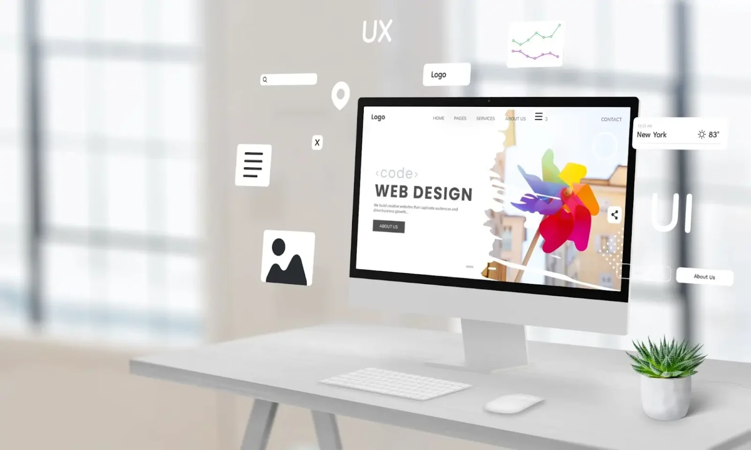
Minimalist web design gets right to the point by keeping websites clean, simple, and easy to use. Instead of crowding every page with text, images, and heavy animations, this style highlights the exact elements that matter most, making it much easier for visitors to find information and take action.
The shift toward this style makes a lot of sense. People have short attention spans online, and clutter only gets in the way. This guide covers the core ideas behind minimalist design, why it benefits your bottom line, and how to build a clean site that still converts.
What Is Minimalism in Web Design?
Minimalism in web design focuses on removing distractions and keeping only the elements that help visitors find information or take action—every section, image, button, and line of text has a specific job to do. When you remove the unnecessary elements, the remaining content gets a lot more powerful. It is the practical execution of “less is more.”
Why Minimalism in Web Design Has Become So Popular
Web users are impatient. If a site feels chaotic, confusing, or takes too long to load, people will click away and find a competitor who makes things easier.
Minimalism directly addresses this behavior. By keeping the interface straightforward, businesses get some immediate, practical perks:
- Pages load incredibly fast
- Text is easy on the eyes
- Navigation feels completely obvious
- The layout layout scales perfectly on mobile screens
- The whole brand looks professional and modern
Core Principles of Minimalist Web Design
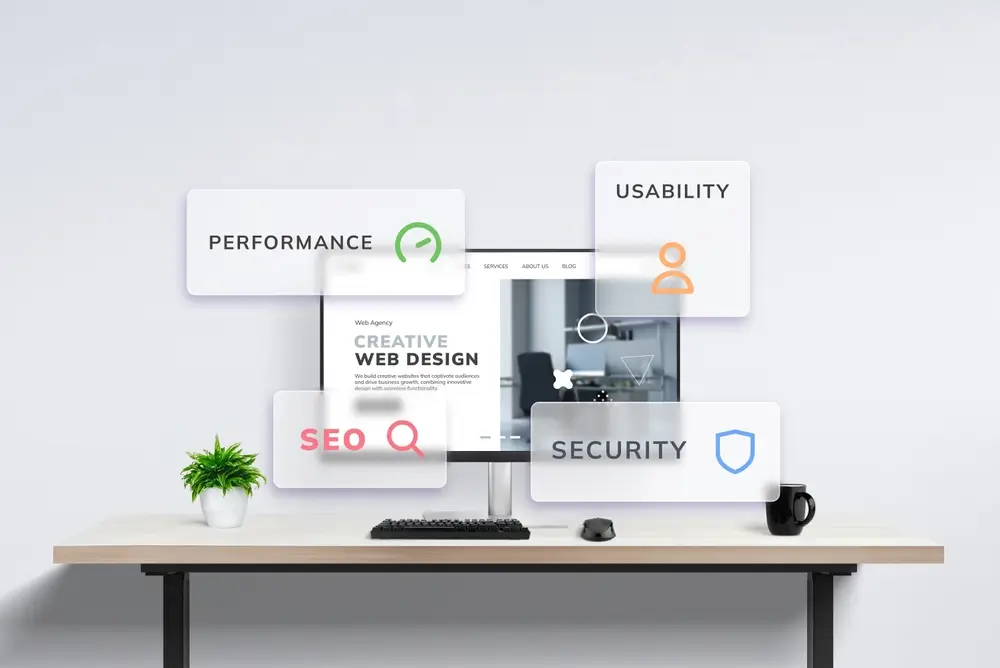
Great minimalist websites rely on a handful of foundational rules to keep things balanced.
| Principle | What It Means |
| Simplicity | Cut out the fluff to keep your visitors focused entirely on the core message and the actions you want them to take. |
| Purposeful Design | Every element must earn its keep. If a button, image, or text block doesn’t help the user, it shouldn’t fill space. |
| Clarity | Straightforward layouts and messaging let visitors know exactly what you offer and where to click within seconds. |
| Consistency | Unified fonts, spacing, colors, and design patterns build a predictable, professional experience across pages. |
| Visual Hierarchy | Strategic layout choices guide the human eye naturally, making critical information stand out without needing loud graphics. |
Common Elements of Minimalist Web Design
Generous Whitespace
Whitespace creates breathing room between elements and helps reduce visual clutter.
Simple Navigation
Minimalist websites often feature streamlined menus and clear navigation paths.
Limited Color Palettes
Many minimalist websites use a restrained color palette with one or two accent colors.
Clean Typography
Readable typography becomes a central design feature when fewer visual elements compete for attention.
High-Quality Imagery
Minimalist websites typically use fewer images, making image selection more intentional and impactful.
Benefits of Minimalism in Web Design
Improved User Experience
Visitors can focus on the information they’re looking for without distractions.
Faster Website Performance
Fewer design elements often result in faster loading times.
Better Mobile Experience
Minimalist layouts typically adapt well to smaller screens.
Stronger Conversion Rates
Clear calls to action and reduced distractions can help improve conversions.
SEO Advantages
Minimalist websites often support:
- Faster page speed
- Improved user engagement
- Better site structure
- Lower bounce rates
These factors can contribute to stronger SEO performance.
Common Minimalist Web Design Mistakes
Clean design requires a lot of restraint, and it is remarkably easy to take the concept too far.
Removing Too Much Content
Simplicity shouldn’t come at the cost of information. Visitors still need enough clear context and detail to make a confident decision.
Prioritizing Style Over Usability
A website can look like a modern art piece, but if your visitors can’t find the menu or figure out how to scroll, the design fails.
Weak Calls to Action
Your “Get in Touch” or “Buy Now” buttons shouldn’t blend completely into the background. Stripping down a page should never hurt your sales.
Poor Contrast and Readability
Light gray text on a white background might look sleek to your designer, but if your customers have to strain their eyes to read your copy, they won’t stay for too long.
When Minimalism May Not Be the Right Choice
Minimalism works well for many websites, but it isn’t always the best fit.
For example:
- Large eCommerce stores often require more complex navigation.
- News websites may need to display large amounts of information.
- Membership platforms may prioritize functionality over simplicity.
The best approach is often finding the right balance between simplicity and functionality.
Best Practices for Implementing Minimalism in Web Design
Start With User Goals
Focus on what visitors need to accomplish on your website.
Prioritize Essential Content
Remove anything that doesn’t support the user’s journey.
Use Whitespace Intentionally
Allow content and design elements room to breathe.
Focus on Mobile Users
Design with mobile usability in mind from the beginning.
Optimize Performance
Compress images, minimize unnecessary code, and improve loading speed.
Bringing Minimalist Design and Business Goals Together

Creating that balance between simplicity and performance takes careful planning. But if you don’t know where to start, you can partner with an expert like LeadOrigin.
Contact LeadOrigin today to learn how our web design and development services can help strengthen your online presence.
Key Takeaways
- Minimalist web design centers on simplicity, clarity, and utility.
- Clean layouts improve both user experience and website performance.
- These sites usually load faster and boost your SEO.
- Every single element on the page must serve a clear purpose.
- The best minimalist sites balance clean aesthetics with easy usability.
Frequently Asked Questions
What actually is minimalist web design?
It is a style that cuts out the clutter. Instead of packing a page with endless features, it keeps only what a user needs to get things done. It trims the fat.
Why should I care about minimalism?
Because it removes distractions. When you clean up your site, it loads instantly, becomes easier to navigate, and feels much better to browse. Customers stay happy.
Does a minimalist design help my SEO?
Yes. Search engines love fast websites. Because minimalist pages load quickly and keep people from hitting the back button, they naturally rank higher.
What are the main rules of minimalism?
It relies on a few simple choices: clear layouts, consistent styling, plenty of breathing room, and ensuring every single image has a job to do. Nothing is random.
Is it a good fit for every business?
Not always. While it works wonders for service providers, giant online stores or news sites need data-heavy layouts to show everything off at once.
How can my business start using it?
Start small. Audit your current site and strip away anything that fails to add value. Shorten your menus. Add empty space. Make your call-to-action buttons impossible to miss.