You’ve probably heard the term “responsive web design” floating around the internet lately. What does it mean? Why should you care? And what does it have to do with your business?
We’re here to help. In this blog post, we’ll explain what responsive web design is!
What is responsive web design?
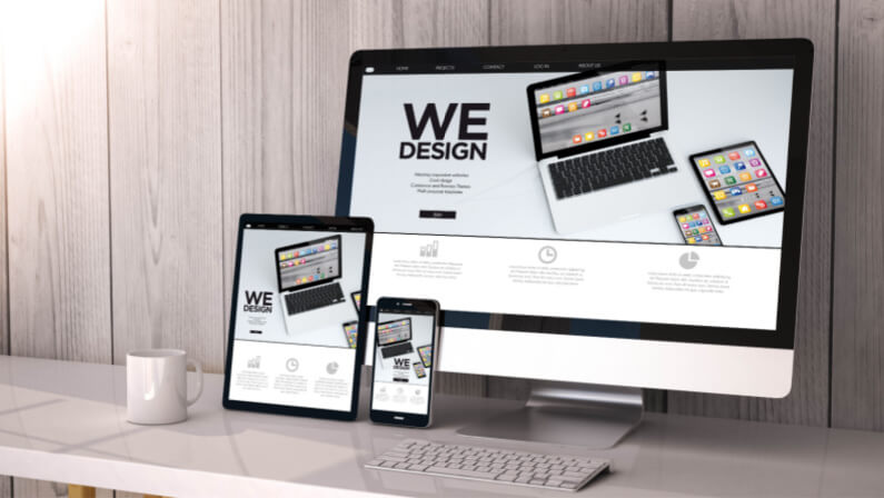
According to the principle of responsive web design, design, and development should adapt to the environment and behavior of users based on factors such as screen size, platform, and orientation.
The technique combines adaptable grids and layouts, graphics, and a clever application of CSS media queries. The website should immediately transition to account for resolution, image size, and scripting capabilities as the user moves from their laptop to an iPad or a mobile device.
The user may also need to take into account the settings on their devices; for instance, if the user has an iOS VPN installed on their iPad or phone, the website shouldn’t prevent them from seeing the page.
In other words, the website should be equipped with the necessary technologies to react to user choices automatically. This would do away with the requirement for a distinct design and development stage for each new device introduced to the market.
Why use responsive design?
Websites with responsive web design load more quickly and are simpler to use. Users are more likely to stay on your website since it makes it easy for them to discover the information they need later. Additionally, excellent usability may persuade visitors to return to your website in the future.
How does responsive web design work?

In order to serve varied style properties depending on the screen size, orientation, resolution, color capabilities, and other features of the user’s device, responsive web design uses Cascading Style Sheets (CSS). The viewport and media queries are a couple of instances of CSS properties related to responsive web design.
Responsive Web Design vs Adaptive Design
Responsive design modifies the rendering of a single-page version, in contrast to adaptable design, which does not. Contrarily, the adaptable design offers numerous wholly distinct iterations of the same page.
Although the approaches are distinct, they are both important web design trends that allow webmasters to control how their site appears on various devices.
With responsive design, users may access the same basic file through their browser on any device, but CSS coding manages the layout and alters how it appears depending on the size of the screen. With an adaptable design, a script accesses the template created for that device after determining the screen size.
The Importance Of Responsive Web Design
When it comes to web design, there’s one thing you can’t forget: your audience.
Your website needs to be responsive so that it can be viewed on any device—whether that’s a desktop computer, tablet, or mobile phone. It’s important for your website to be easily navigable and readable in any situation because you never know what kind of device your audience might be using when they visit your site.
A responsive design means that the content is automatically adjusted based on the screen size of the device accessing it.
For example, if someone visits your site from their phone, they’ll see a version of the site that has been optimized for smaller screens—and if someone visits from their computer at work or home, they’ll see something different than what was shown on their phone. A responsive design ensures that your message is always clear no matter where people are viewing it.
Why Responsive Web Design Is Good For SEO
Responsive web design is a great way to optimize your website for search engines and improve your SEO.
There are a lot of things that go into optimizing your website for search engines, but one of the most important is making sure that it’s easily accessible by all types of users. Responsive web design allows you to create one site that automatically adjusts itself based on the device used to access it.
This means that people using their phones won’t have to zoom in on an image or click on a link only to have it open up in a new tab—they’ll be able to view your content in its full glory right away.
Are WordPress sites responsive?
The WordPress site’s theme determines whether or not it is responsive. A WordPress theme manages the look and feel of your content, much like a static website template might.
The design is responsive if you use a default WordPress theme like Twenty Twenty, but because it has a single column, you might not notice it when viewing it on various displays.
Using Chrome Developer Tools or comparing how it appears on various devices will allow you to determine whether another WordPress theme you are using is responsive or not.
The Building Blocks of Responsive Web Design
If you’re building a website and trying to make it work on all devices, the first thing you’ll need to learn is the basics of responsive web design.
Media Queries
Media queries let you target particular types of devices or browsers with CSS code. For example, if you want your content to be displayed in a different way on phones than on desktop computers, you can use media queries to do so. You can also use media queries to show content only when users are using a specific type of browser or device.
Fluid Layouts
Fluid layouts allow your website’s layout to adapt as the size of the browser window changes. This means that your site will look good no matter what size screen it’s being viewed on. Fluid layouts are especially important on mobile devices where users may be viewing websites from their phones’ small screens.
Flexbox Layout
Flexbox layout is an emerging standard for laying out elements within a webpage that allows for more flexibility than other methods like floats or floats (float). It makes it easy to create flexible grids and even single-column layouts that change when screen sizes change without having to add any extra CSS code!
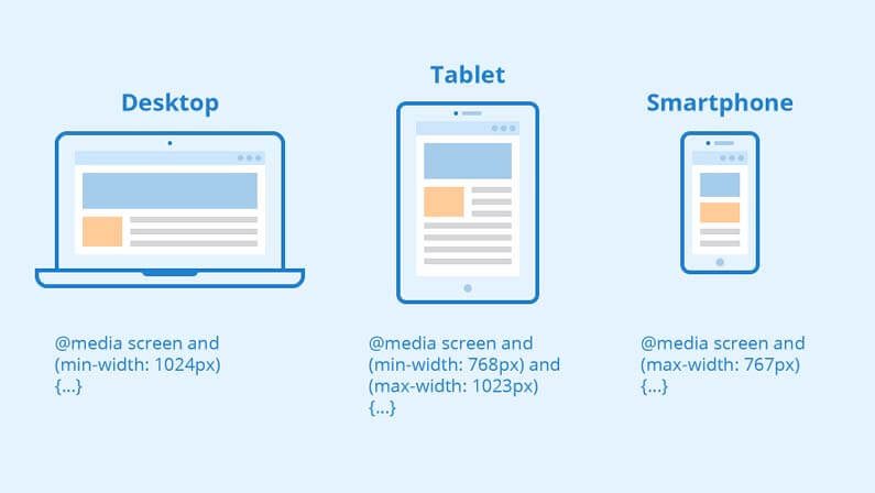
Common Responsive Breakpoints
You must choose the “responsive breakpoints” or “screen size breakpoints” before you can work with media queries. A breakpoint is the width of the screen at which you apply new CSS styles using a media query.
Standard screen sizes:
- Smartphone: 360 x 640
- Smartphone: 375 x 667
- Mobile: 360 x 720
- Pixel 2: 411 x 731
- iPhone X: 375 x 812
- Tablets: 768 x 1024
- Laptops: 1366 x 768
- Desktop or laptop resolution: 1920 x 1080
You don’t need to include mobile breakpoints if you take a mobile-first approach to design, using a single column and lower font sizes as the foundation unless you wish to optimize the design for particular models.
Therefore, you only need to include two breakpoints when creating a basic responsive design: one for tablets and one for laptops and desktop PCs.
How to Make Your Website Responsive
Let’s take a look at how to make your site responsive and easy to view anywhere.
Put your media query ranges in place
When you’re creating a responsive design, you’ll want to use media queries so that your styles change depending on the size of the browser window. You can set these breakpoints by hand, but it’s much easier to use something like Bootstrap or Foundation. These frameworks offer pre-built CSS classes for common devices like mobile phones and tablets, so all you need to do is pick one and adjust it as needed.
Size layout elements with percentages or create a CSS grid layout
The easiest way to make sure your layout adjusts properly is by using percentage measurements. If you have a fixed width element that needs its space adjusted based on screen size (like buttons or other content), make sure it shrinks proportionally with the rest of the page so that everything stays aligned properly no matter how big or small.
Implement responsive images

You can easily add responsive images to your website by using responsive image tags. This will make sure that mobile users don’t have to download large images that are unnecessary for their devices, and it also ensures that your page loads quickly on any device.
Use responsive typography for your website text
You should also include a line height of 1.5-2 as part of your CSS for all elements of your site if you want it to be responsive. This will help keep the font from looking too compressed or too stretched out when viewed on mobile devices, which can result in a bad user experience for them (and therefore for you).
Overall
A responsive web design is an essential tool for any business that wants to be able to reach its target audience. It’s not just about aesthetics; it’s about providing an experience that is tailored to your users’ needs.
If you’re looking for help with your website, or if you’re just feeling overwhelmed by all of this new knowledge, don’t hesitate to reach out! LeadOrigin can take all the complexities and do the heavy lifting for you. We have offices located in Austin, Houston & Dallas, and we’d love to hear from you!